In this design study, the rollout of Vantablack's debut album must create a strong identity, effectively communicate the feeling of their music, and encourage shopping behaviour in a manner that feels authentic to the band.
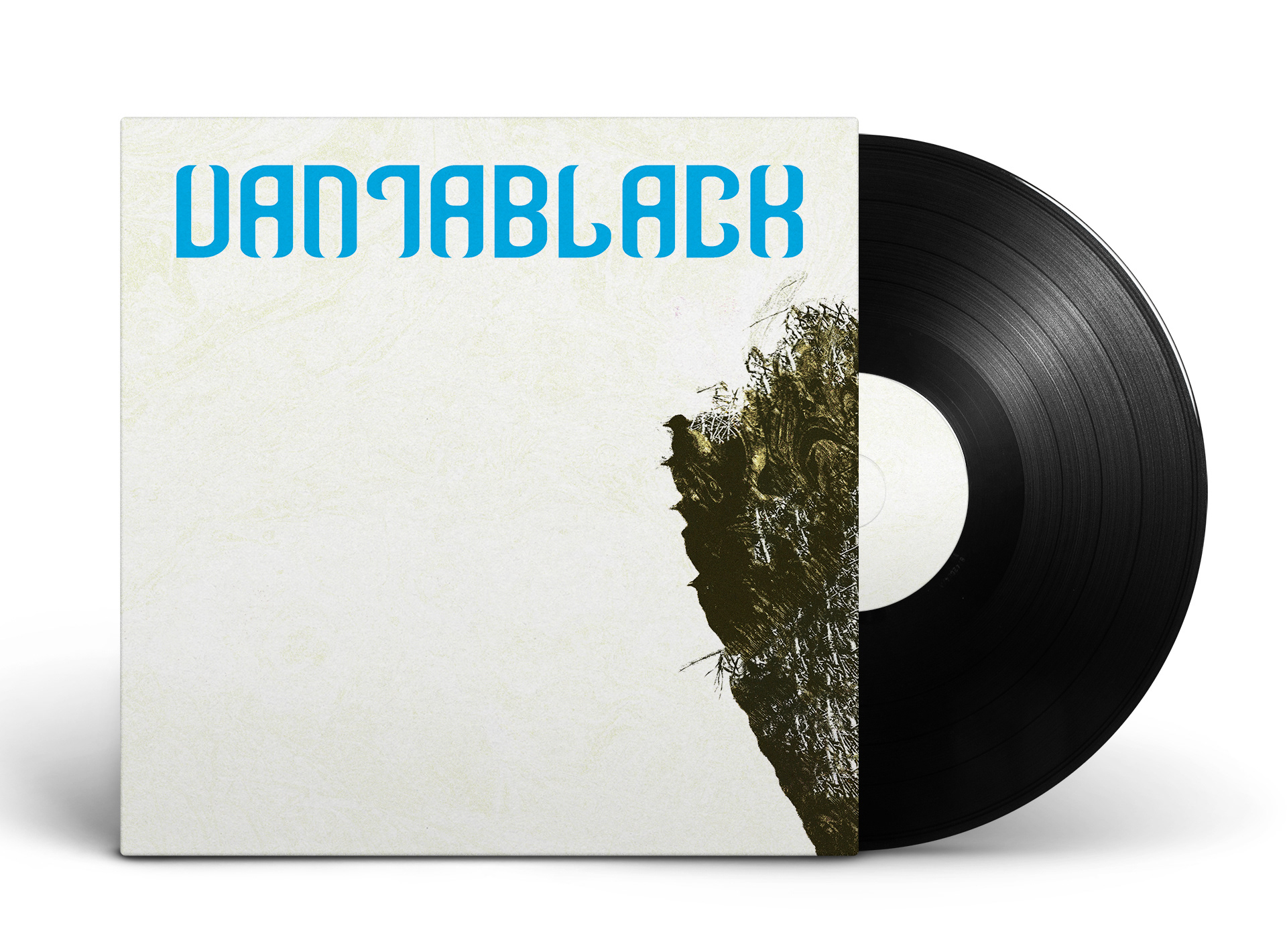
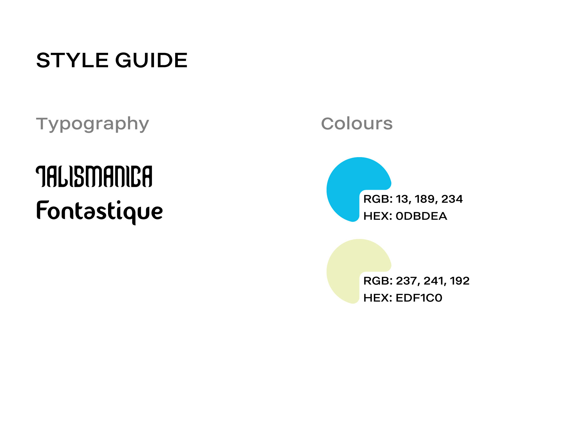
In forming an identity for Vantablack, I knew that I must maintain a specific style throughout this rollout. With a smart use of asymmetrical balances, complementary typography, and minimalism, I was able to develop a trendy, cohesive, and intriguing identity for this upcoming band.
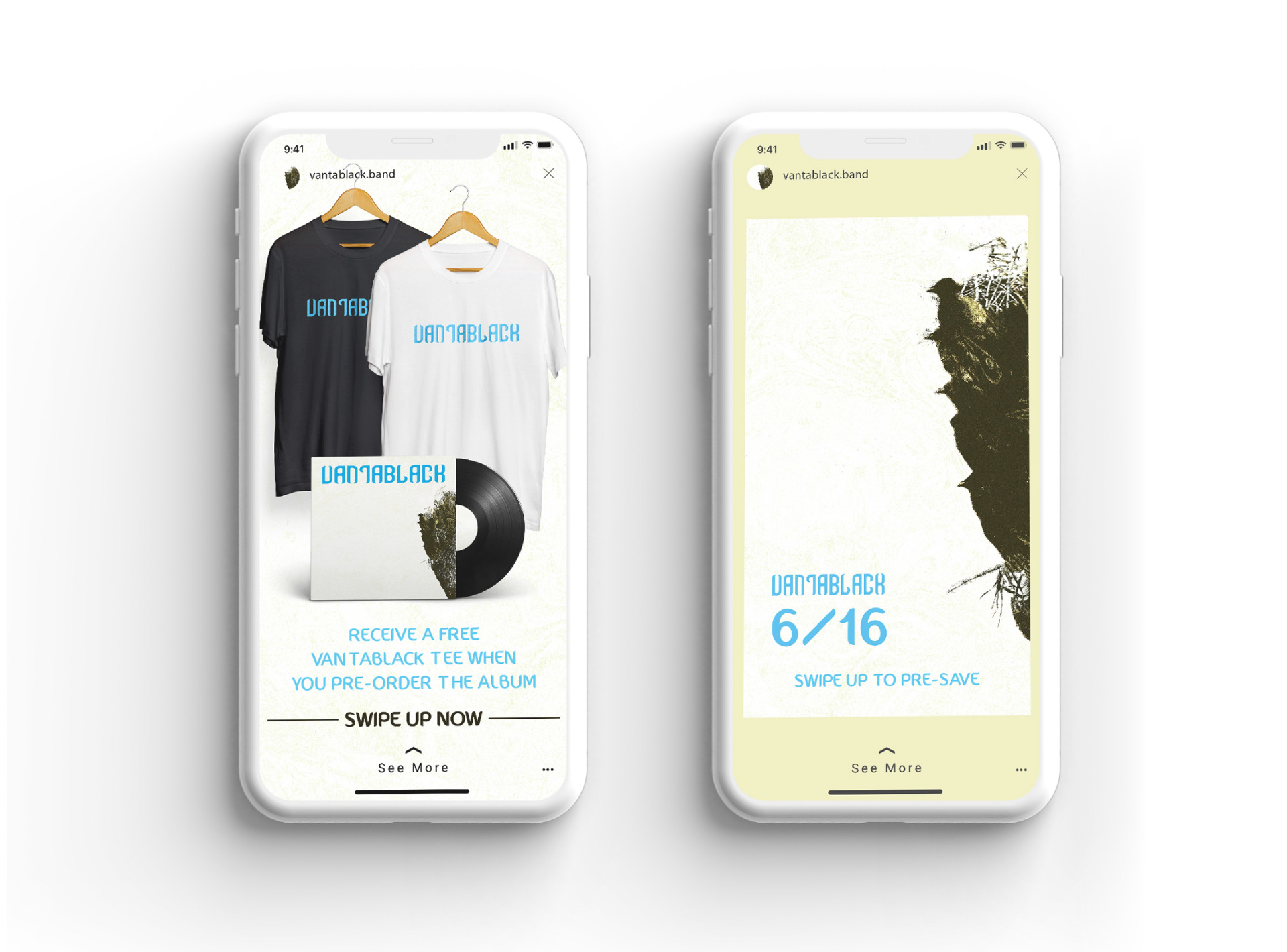
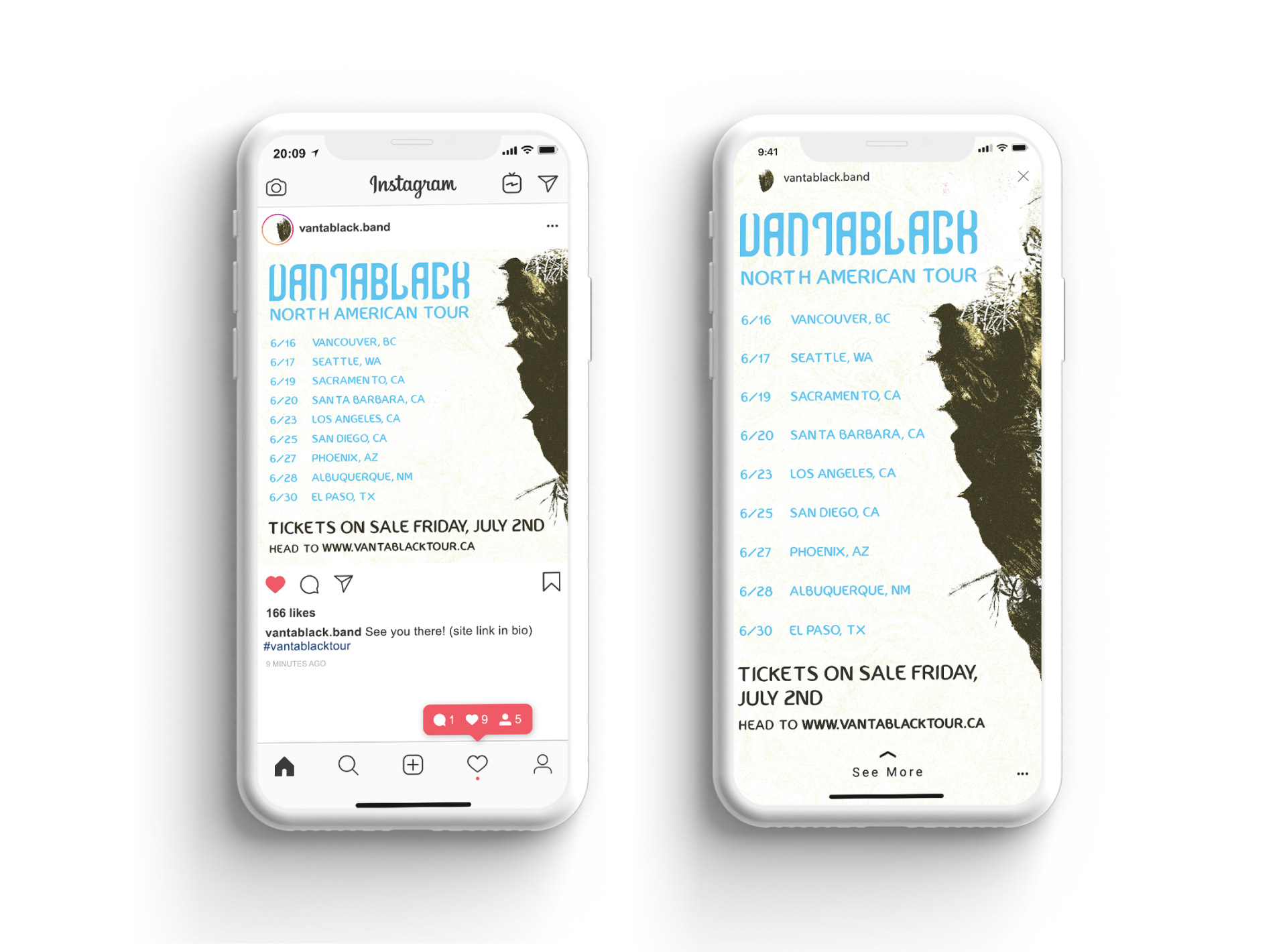
The music of Vantablack is aggressive, experimental, and minimal. As the blue and yellow colour scheme would typically reflect joy, I decided to pair this duo with grungy, bleak visuals to create a world of depth. I find that this contrast effectively reflects their experimental and disruptive style.
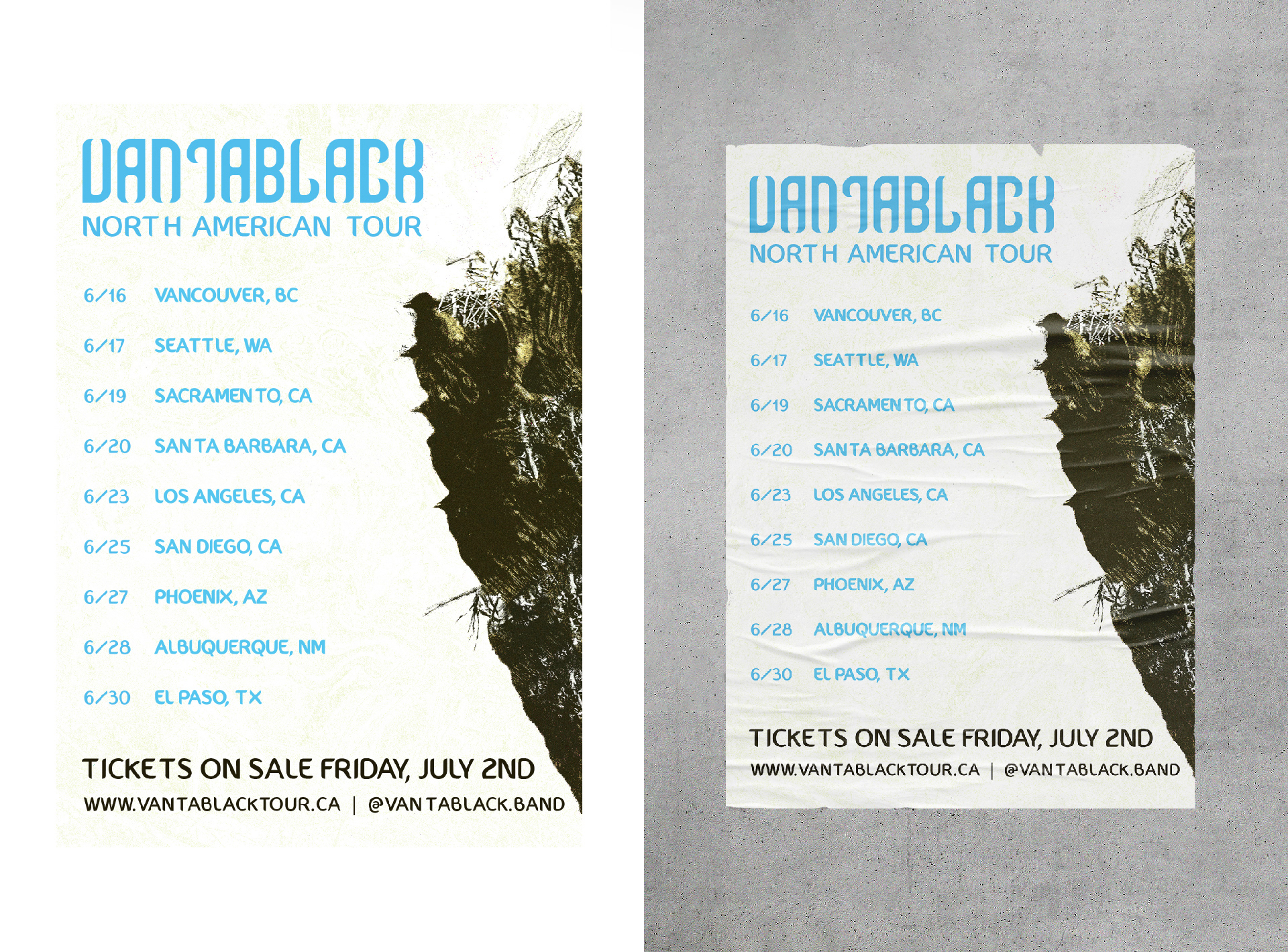
Creating promotional assets for Vantablack's debut album and upcoming tour was a matter of prioritizing information clarity and brand consistency across multiple mediums. Fluid layout design that guides the reader to a strong yet simple call-to-action is key in creating promotional assets that perform well.